Contrast in the dictionary is explained as 'a distinction or emphasis of difference by comparison of opposite or dissimilar
things'. The most popular and often thought of way to create contrast is by using strong colour contrasts such as 'black and white'.
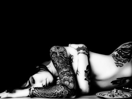
The lighting in this photo (above) really emphasises the contrast between the light skin and dark tattoos. Now let's take a look at black and white contrast within Interior Design.
Creating elements of contrast within a design adds visual stimulation as well as 'interest' to a space. Rather than the usual black and white, there are many colours and tones that can be used to create contrast that mustn't be overlooked.
Accent walls are a popular way of doing this but don't limit your imagination to just painted walls.
 |
| Your eye is immediately drawn to the sexy lipstick red coloured cooker. |
By injecting an unexpected element such as the bright red coloured stove above, there is a suggestion of playfulness in this rustic farm kitchen. Notice how the red is also repeated a few times throughout the room : - the numbers on the clock; the wall tiles and various accessories. This helps give flow to the space and support the otherwise 'out of the norm' colourful appliance.
Another way to create
juxtaposition is by mixing Interior Design styles.
In the above picture, a traditional tufted and skirted camel back sofa has been paired successfully with more modern elements such as - the contemporary patterns on the throw cushions; a wild zebra area rug and small ghost tables. This type of contrast within designs work well when the pieces have been balanced and styles have been repeated.
In the photo above the classic fauteuil chair has 2 different patterns that are no reflection of the actual period piece itself, but no one could argue that they would definitely make quite the conversation piece!
What about Creating Contrast by using various shapes? This room below is a great example of how different shapes, forms and lines can all be used to create contrast. Again, opposing textures such as the shiny satin bedding, crushed velvety head board and sparkly crystals are all contributing to this mix of contrasting elements.
 |
| In my opinion the lamps don't seem right in this space |
Next time you are decorating a space, why not get creative and use contrast in more ways than one?
Also, this MAY just be the month for you! For all subscribers of ~delicious decor~ I will be sending out my 'DECOR TIPS FOR CREATING A BEAUTIFULLY DESIGNED SPACE'. If you are not yet subscribed to ~delicious decor~ but would like these fantastic tips list, please sign up to my blog before May 31st and I will be sure to send you this exclusive offer you don't want to miss!
If you want help in
Creating Contrast Designs, then please contact me and I can help you fall in love with your home again! e-mail:
claire@creatingcontrastdesigns.com


No comments:
Post a Comment